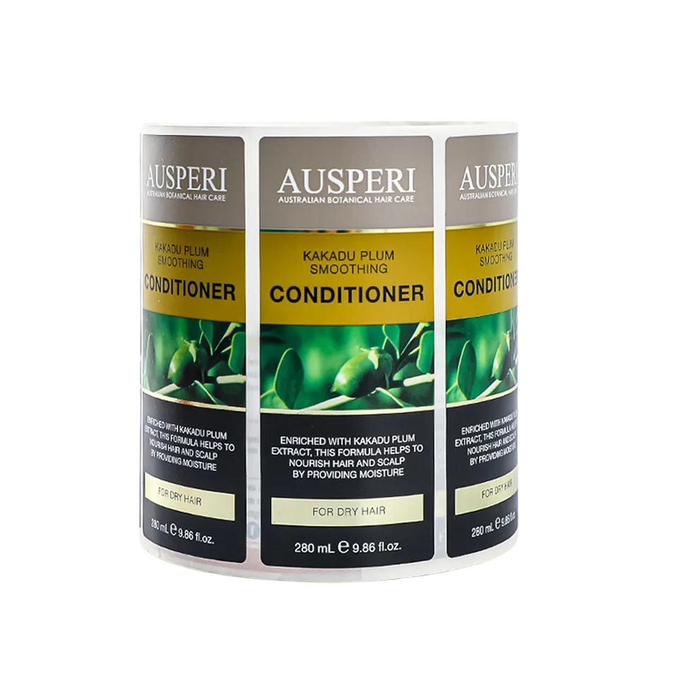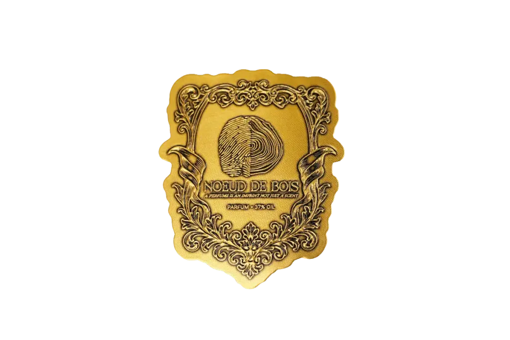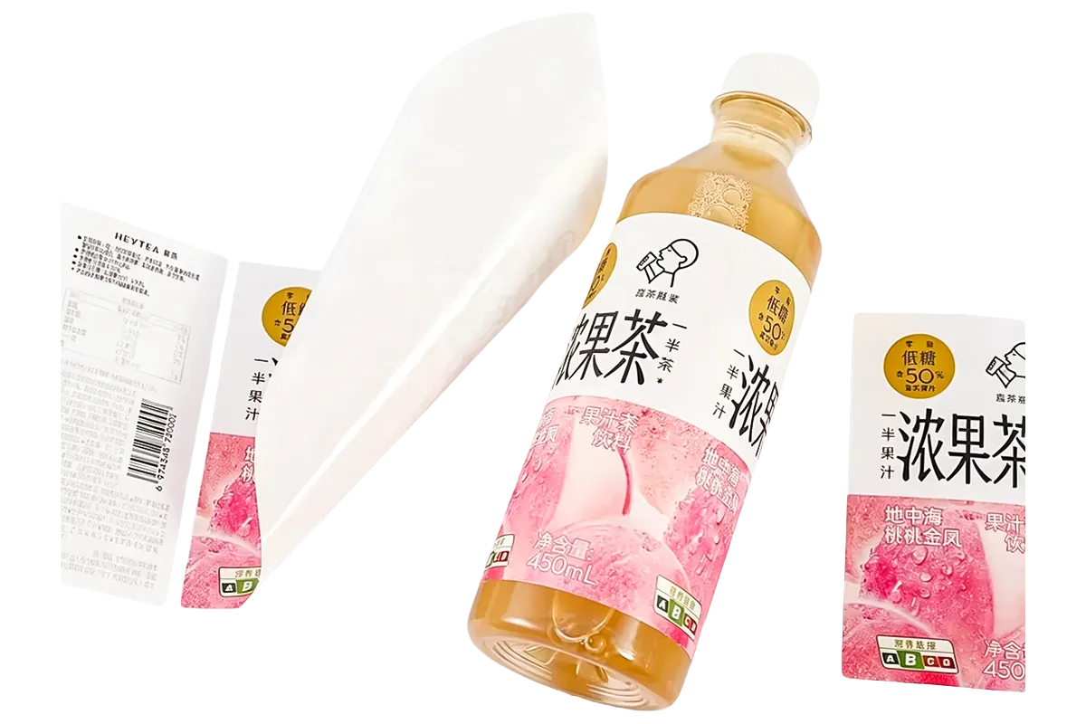
Color does more than decorate a bottle or jar. It tells shoppers what a product tastes like, how natural it is, and how much it should cost before they read a single word. Label color trends for food and beverage brands now favor muted earth tones, one bold accent per pack, and print effects that change how a color reads on the shelf.
The palette a brand picks never works alone. It has to survive the label material, the finish, and the lighting of a real shelf, where the same red looks different on coated paper, clear film, and uncoated kraft. This article explores emerging food and beverage label color directions for 2027 and 2028, explains how color choices relate to flavor and brand positioning, and examines how printing materials and finishes affect color consistency across product lines.
Food and Beverage Color Trends Shaping Brand Identity
Today’s food and beverage palettes mix grounding earth tones with one or two high-energy accents, and every choice points back to the brand story.
Pantone’s 2026 Color of the Year, Cloud Dancer (PANTONE 11-4201), is a soft, airy white associated with simplicity and visual calm. Following Mocha Mousse in 2025, it highlights the growing design interest in understated neutrals and versatile color combinations. For food and beverage labels, these tones offer a flexible base for pairing brand colors, product imagery, and metallic accents.
Earth Tones and Muted Neutrals
- Coffee and cocoa browns: Roasted notes on coffee, chocolate, and bakery labels now reach into sauces, snacks, and protein lines.
- Oat, cream, and sand neutrals: Soft warm bases replace stark white on pantry labels, and they make photography and gold foil accents stand out.
- Sage, olive, and moss greens: These muted greens signal natural ingredients without the bright green of a decade ago.
- Cloud Dancer blue-grey: Airy blue-grey tints appear as backdrops on dairy, sparkling water, and functional drinks.
Bold Accent Colors on a Quiet Base
The quiet base does not mean quiet shelves. Most trend palettes keep one saturated accent, usually an electric orange, deep berry, or cobalt, reserved for the flavor name or the brand mark.
- Consistent accent colors help shoppers recognize familiar SKUs across a product range, making flavor and variant identification easier on crowded retail shelves.
- One accent per pack stays legible; two or three compete and blur the flavor message.
- Accent hues drawn from the flavor itself, such as a chili red for hot sauce, do the hardest selling work.
Substrate Effects on Trend Colors
A color that looks consistent on screen can produce different results across label materials. For example, a light beige printed on white coated paper may appear cleaner, while the same artwork on kraft paper can take on a darker, warmer appearance because of the substrate’s natural color. For transparent labels, selective white ink can help maintain the visibility of key design elements without covering the entire surface.
At the sampling stage, comparing printed colors across the intended substrates helps identify these differences before bulk production.
Popular Label Color Palettes by Product Category
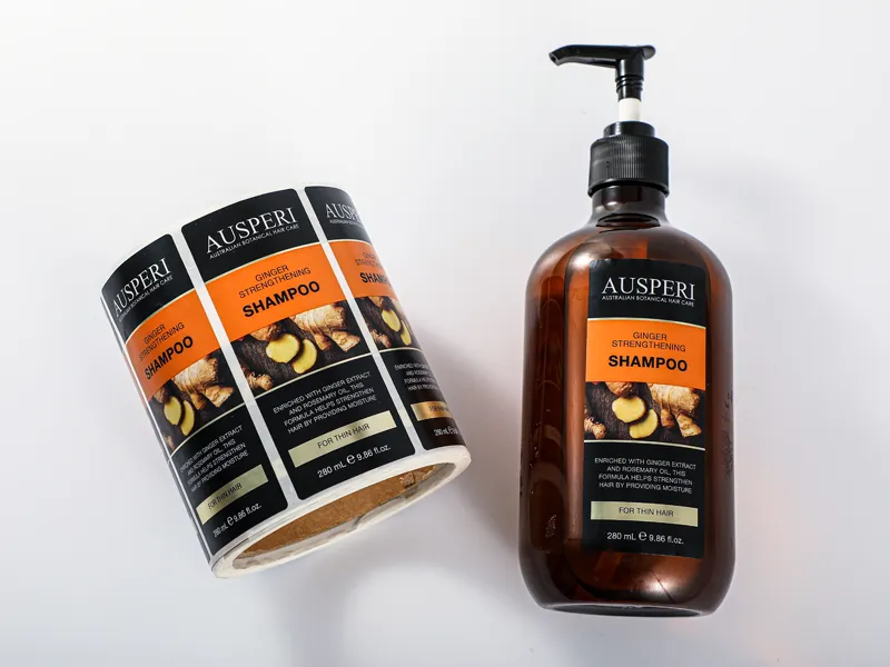
Palette choices track product category closely because shoppers bring fixed color expectations to each aisle, from coffee browns to juice reds.
Within the broad trend, each food and beverage category keeps its own color grammar. The table below summarizes the palettes that dominate each aisle in 2027 and 2028.
| Категория продукта | Common Palette | What the Colors Signal |
|---|---|---|
| Coffee and tea | Deep browns, black, cream, gold accents | Roasted, premium, craft |
| Juice and smoothies | Fruit reds, oranges, berry purples | Fresh, direct, flavor-forward |
| Dairy and plant milks | White, soft blue, oat and almond tones | Clean, mild, trustworthy |
| Snacks and confectionery | Bright yellow, red, candy pink | Fun, indulgent, impulse |
| Sparkling water | Clear labels, pastels, citrus hues | Light, refreshing, low sugar |
| Sauces and condiments | Tomato reds, chili oranges, herb greens | Bold flavor, kitchen staple |
Why Aisle Expectations Matter
Shoppers learn these palettes over years of trips, and a label that breaks them has to work harder. A black coffee bag reads premium; a neon green coffee bag reads energy drink, which is the wrong shelf for a single-origin roast.
For beverage lines, the palette also has to hold up on curved glass and plastic, where shrink and glare distort color at the edges of the bottle. See our article on what should you consider when choosing bottle labels for the container-side factors. Within the chosen palette, keep the flavor anchor color constant across the line so repeat buyers can find the SKU.
Color as a Signal for Flavor, Ingredients, and Product Positioning
Color is a pre-literate signal: shoppers read flavor, sweetness, and naturalness from a label before they read the ingredients.
Flavor Cues Across the Spectrum
- Red and berry: Sweet-tart profiles for juices, yogurts, and confectionery.
- Yellow and citrus: Bright acidity and energy on sodas, teas, and energy drinks.
- Brown and tan: Roasted, chocolate, or baked notes across coffee, snacks, and bakery.
- Green: Herbal, botanical, or fresh vegetable cues.
- Purple: Grape and dark berry flavors with a premium edge.
Clean-Label and Natural Cues
Color also codes how processed a product looks. Muted, matte palettes on kraft or textured paper read as small-batch and natural, which is why organic and clean-label brands avoid neon. Food-grade label printing keeps these natural looks shelf-safe without limiting the palette a brand can use.
Premium vs Value Positioning
The same category can price at either end of the shelf through color alone. Black, cream, and metallic accents say premium; bright primary colors and busy layouts say value and family-size. The label print should match the claim: foil and embossed textures belong with the premium palette, not the value one.
Custom Labels Printed in Your Exact Brand Colors

Label Substrates and Finishes Changing Color Appearance

The same ink prints differently on coated paper, clear film, and textured kraft, so substrate and finish choices shape the final color.
Paper vs Film Color Rendering
Coated art paper generally provides a smoother printing surface, helping preserve fine details and consistent color coverage. Uncoated and kraft papers have more absorbent surfaces, which can reduce color intensity and allow the base material to influence the final appearance. Clear film labels offer a transparent look, while a white ink underprint can improve opacity and color visibility where stronger coverage is needed.
Lamination and Coatings
Finishes adjust the tone one more step. A gloss laminate deepens and saturates color, a matte laminate softens it, and a soft-touch coating mutes it with a frosted look. See our article on how to choose the right lamination for your product labels before committing to a finish. The finish should be fixed before color approval, because approving color first and changing the laminate later moves the shade.
Foil and Metallic Accents
Gold and silver foil add a metallic highlight that no ink can reproduce, and they change how the colors next to them read. See our article on how hot foil and cold foil differ for label printing to compare the two processes. On dark labels, foil lifts the whole palette; on light labels, it adds a premium frame.
Maintaining Color Consistency Across Product Lines and Reorders
Color consistency is a process, not a promise: Pantone references, digital proofs, and press-side checks keep a shade stable from first run to reorder.
Working from Pantone References
Brand colors should be defined using Pantone references or approved CMYK values during the design stage. Spot color printing offers greater control over brand color reproduction, while CMYK results can shift due to differences in printing conditions and substrates.
For multi-SKU product lines, printers should record the approved color reference, substrate, ink specifications, and finishing details to support consistent reproduction across future orders.
Proofs and Press Checks
- Digital proofs confirm layout and artwork but not final color, since screens and office printers shift hues.
- Drawdowns and press proofs print the ink on the real substrate, which is the closest preview of the production result.
- Approved samples travel with the job so the press operator can match color by eye and by measurement.
Reorder Consistency Practices
Reorder drift usually comes from small changes: a different film batch, a new laminate, or a rebuild of the artwork file. Keeping the ink formula, substrate, and finish on record with one supplier, and approving each reorder against a retained standard sample, keeps the shelf color stable across years. Small measured differences are normal between runs, and good printers hold them inside an agreed tolerance rather than chasing an impossible exact match.
Frequently Asked Questions
What do the colors mean on food packaging?
Colors on food packaging work as a short visual code. Warm reds and oranges point to energy, appetite, and bold flavor. Greens point to fresh or natural ingredients, and blues to calm or cooling refreshment, while browns and creams suggest roasted, baked, or craft qualities. Brands apply the code differently by category, so the same red means sweet berries on a juice bottle and heat on a hot sauce label.
What do the different colors on food labels signify?
Label colors generally signify flavor, category, or brand positioning rather than a regulated meaning. Red and orange often signal bold or spicy flavors, green signals herbs, botanicals, or organic positioning, purple points to berry or grape flavors, and black with metallic accents signals premium quality. No universal rule assigns colors to products, so brands should match the palette to their category expectations.
What are the best colors for food packaging?
The best colors depend on the product and the shelf context. Appetite-driven categories like snacks and fast food lean on red and yellow, fresh categories on green and white, and premium lines on black, cream, and gold. The strongest packaging palettes pair one appetite color with a neutral base and print the shade on the actual label substrate before committing.
What colors attract food customers?
Warm, high-saturation colors attract the most attention in food retail. Red, orange, and yellow perform strongly because they stimulate appetite and read fastest on a crowded shelf. A single bright accent against a neutral background draws the eye before softer pastels do. Attention still needs a clear brand mark, because a striking color alone does not build recognition.
Why is the color red used so often in fast food marketing?
Red is associated with energy, appetite, and urgency, and it stays highly visible in signage and packaging. Fast food chains use it because it stimulates attention and pairs well with yellow, which reinforces speed and value cues. The same logic carries into retail packaging, where red accents help impulse categories stand out.
What is the best color for packaging?
There is no single best color, because packaging color succeeds or fails against the category, the brand, and the shelf environment. Green fits fresh and organic products, black and gold fit premium lines, and warm reds and yellows fit impulse foods. The practical answer is to test the chosen palette on the real label material, since substrate and finish shift the final shade.
What colors symbolize food?
The colors most associated with food are warm and earthy. Red stands for ripe fruit and appetite, orange for citrus and spice, yellow for freshness and energy, green for vegetables and herbs, and brown for baked, roasted, or craft products. Purple and blue appear less often in food but signal premium berry flavors and cooling refreshment.
What is the most popular color of food?
No single color dominates food overall, but warm tones lead the appetite-driven categories. Red and yellow appear most often in fast food and snacks, while green and natural browns now lead in health-oriented and organic lines. Trend forecasts for 2027 and 2028 show muted earth tones and soft neutrals gaining share across food and beverage labels.
What should food labels not contain?
Food labels should not contain misleading claims, undeclared allergens, illegible text, or artwork that obscures required product information. In print terms, they also should not use colors that hurt contrast, because low-contrast type on a busy background fails legibility checks at small label sizes. Brands should run artwork past their compliance review before the plates or print files are made.
Conclusion
Color on a food or beverage label does three jobs at once: it signals the flavor, positions the product on the shelf, and builds the brand memory that drives repeat purchase. The palettes gaining ground in 2027 and 2028 do that work with muted naturals, one bold accent, and finishes chosen to control the final tone.
For brands planning a new label program, Meikei prints food and beverage labels with Pantone matching, sample proofs on the real substrate, and reorder records that keep brand colors stable across runs.