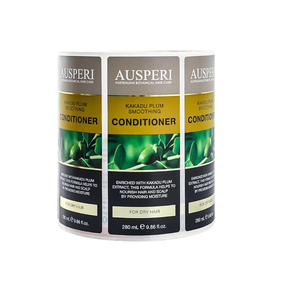
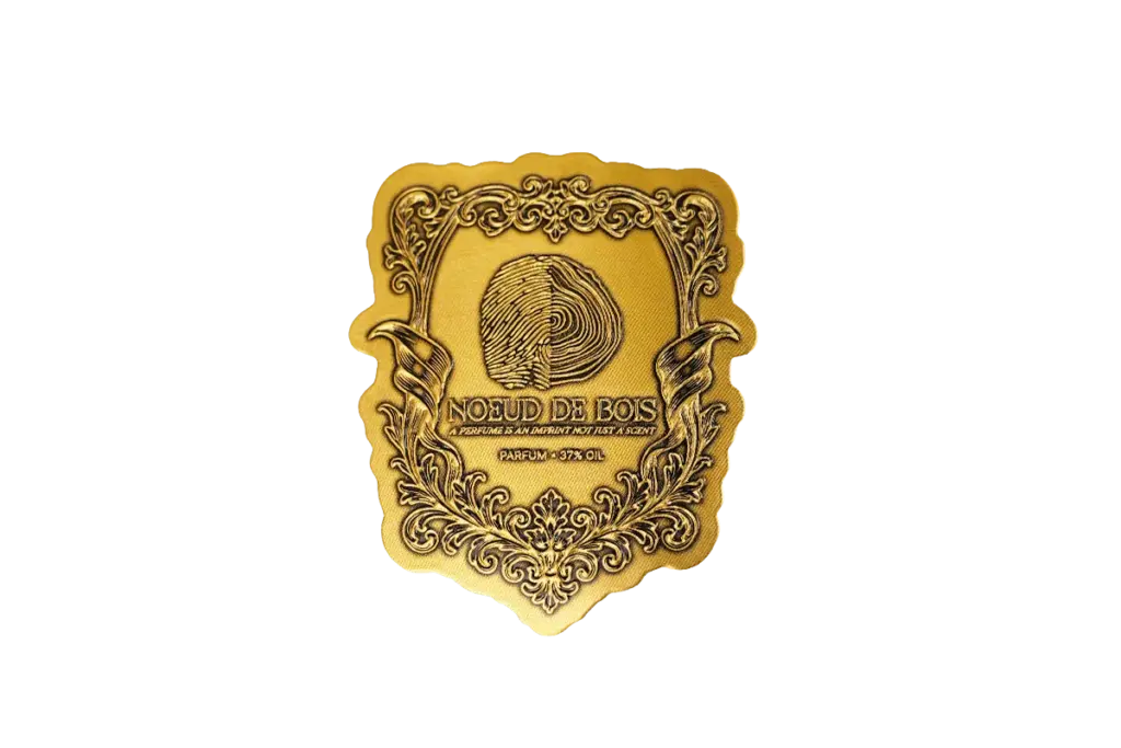
Shoppers decide in seconds, and most of the deciding happens before a single word is read. Label design influences consumer perception through color, shape, typography, and material, all of which signal what the product is worth and who it is for. The design is the product’s first salesperson and its loudest one.
This guide walks through the perception levers in the order a shopper meets them: the first visual impression, the readability moment, the information scan, the touch, and the category context. Each section ends with the design choice that moves the needle, because perception is built in sequence, not all at once.
Color and Visual Cues That Shape First Impressions
Color registers before words do: a shopper reads the palette, the contrast, and the mood of a label in the first half second.
Color psychology on the shelf is more category convention than universal law. The same red that reads energy on a snack label reads heat on a hot sauce label and premium on a wine label, because the surrounding design carries half the meaning. The table below shows the working associations brands rely on, and the category context behind each one.
| لون | Perception It Creates | Where Brands Use It |
|---|---|---|
| Red and orange | Appetite, energy, bold flavor | Snacks, sauces, fast-moving food |
| Green | طبيعي, fresh, organic | Organic food, botanicals, wellness |
| Blue | Clean, cooling, trustworthy | ماء, dairy, clinical care |
| Black and gold | غالي, crafted, serious | Spirits, chocolate, high-end lines |
Contrast and Shelf Visibility
Perception starts with being seen. High contrast against the shelf background and against neighboring products lifts a label out of the crowd, which is why many redesigns begin with a contrast audit rather than a palette change. The brand block and the product name need the strongest contrast on the panel. A pale label on a pale shelf is invisible no matter how beautiful the artwork.
Shape and Die-Cut Cues
The label’s outline speaks before its content: soft arches and circles read crafted and feminine, sharp rectangles read efficient and clinical, and a die-cut window promises honesty about what is inside. The shape sets the frame for every other cue, which is why the die line gets approved before the artwork that fills it.
Typography and Readability at the Point of Purchase
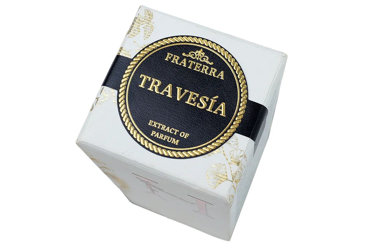
Type carries the message and the mood at once: the same words in a serif read heritage, in a geometric sans they read modern.
What the Typeface Says
Serif families carry tradition and craft, which is why spirits, chocolate, and estate products lean on them. Geometric sans-serifs carry precision and cleanliness, the default for supplements and skincare. Hand-lettered scripts add personality but surrender legibility, so they stay on the brand mark rather than the ingredient list. The typeface choice is a positioning decision wearing a typography costume.
Legibility Under Shelf Conditions
Readability is a physics problem before it is an aesthetic one: type size, line spacing, and contrast all have to survive arm’s-length reading in store lighting. The required text, allergens, ingredients, and dosing, sets the minimum standard, and every decorative choice has to fit around it. A shopper who squints at the ingredients is one step away from trusting the competitor’s clearer label.
The Trust Effect of Clean Typesetting
Messy typography reads as carelessness in the factory, and shoppers transfer that judgment to the product. Consistent margins, aligned baselines, and one deliberate type hierarchy signal a brand that sweats the details, which is exactly the perception premium labels are built to buy. The small-print sections are where sloppiness hides, so they get the same care as the headline.
Typography decisions cascade: the display face sets the mood, the text face carries the detail, and the spacing ties them together. Changing one without checking the others is how otherwise clean redesigns end up looking unfinished on the shelf.
Information Hierarchy and Consumer Decision-Making
The label is read in a fixed order, whether the designer plans it or not: product, benefit, brand, then the details.
The Three-Second Read
In the first three seconds a shopper answers three questions: what is it, why should I care, and does the brand look right for me. The label that answers all three with the largest, clearest elements wins the trial. Everything below that first read supports the decision already made, so it must never contradict it.
Ordering the Supporting Information
After the headline read comes the detail scan: claims, serving or usage, ingredients, and the fine print, each in a predictable place. Shoppers compare labels line by line during the scan, so inconsistent placement between SKUs costs comparison time and, with it, sales. The detail scan is where honest, well-placed information converts skepticism into purchase.
The Gestalt Reading of the Panel
Designers lean on gestalt principles to group elements without boxes and rules: proximity groups related text, similarity ties the flavor family together, and whitespace separates what must stand alone. The shopper never notices the technique, only the ease of reading. When the grouping fails, the label feels busy for reasons nobody can name.
Labels Designed Around the Shopper’s Eye

Materials and Finishes That Signal Product Positioning

Touch closes the sale: the weight, texture, and finish of a label tell the hand what the price should be.
Paper Texture and Perceived Craft
Textured, uncoated, and cotton papers read as crafted and small-batch, which is why artisan food and gifting lines choose them. The tactile signal transfers to the product inside: a rough kraft label promises a handmade product even before the shopper reads the claim. The same paper in a clinical category would read underproduced, which is why material and category are chosen together.
Finishes That Price the Product
Soft-touch coating, foil, and embossing are the premium punctuation marks. See our article on how foil labels are made and our guide on how to create embossed labels for the two techniques shoppers associate most with quality. A single foil accent can lift the perceived value of an otherwise plain pack, because the eye reads the metallic flash as a price signal.
Die-Cut Shape as Positioning
The label’s cut edge is a positioning tool of its own. An arched die-cut frames a wine label like a crest; a scalloped edge adds gifting softness; a straight-edged wrap reads modern and efficient. See our article on kiss-cut vs die-cut stickers for the cutting options behind those shapes. The shape is read from the same distance as the brand name, so it earns a place in the perception plan.
Adapting Label Design to Different Shopper Expectations
Expectations are category-specific: a label that wins in confectionery can look wrong in skincare, so the same principles adapt to the aisle.
Food and Beverage Expectations
Food shoppers reward appetite cues: warm colors, visible product, and benefit language up front. Beverage shoppers add a freshness test, reading cold colors and clear labels as lighter and cleaner. The rules are looser on color but stricter on information placement, where allergens and nutrition have fixed homes that redesigns must respect.
Beauty and Wellness Expectations
Beauty and wellness shoppers read restraint as science: whitespace, clinical type, and a single accent signal efficacy and purity. The same minimalism that reads empty in confectionery reads premium here, which is why category context always wins over universal design rules. Borrowing cues from the wrong aisle is the fastest way to look counterfeit.
Gifting and Premium Expectations
Gifting shoppers are buying an experience for someone else, so texture, foil, and opening rituals carry disproportionate weight. The label has to photograph well for e-commerce and feel good in hand for retail, a dual standard that favors premium stocks and finishes. The person receiving the gift sees the label as part of the present, not its wrapper.
الأسئلة المتداولة
What is label design?
Label design is the visual and structural work that turns a blank label into product communication: layout, typography, color, imagery, and the choice of material and finish. It has to satisfy three readers at once: the shopper scanning the shelf, the buyer reading the details, and the printer who must reproduce it. Good label design serves all three.
What is packaging design?
Packaging design covers the whole pack: structure, مواد, graphics, and the label system that carries the communication. Label design is the part of that system shoppers read most closely. Both answer the same question: what should this product look like to the person standing in front of it.
What are the 7 basic principles of design?
The seven usually listed are balance, contrast, emphasis, proportion, movement, pattern, and unity. On a label, balance distributes the elements, contrast lifts the brand block, emphasis ranks the messages, and unity ties the pack into one voice. The principles are tools; the shelf is where they get tested.
What are the latest design trends?
Current packaging design leans warm minimalism: muted earth tones, one type family, generous whitespace, and natural textures replacing flat white minimalism. Bold accents and hand-drawn details add back the personality. The trend matters less than the fit, because a trend that fights the category reads wrong on the shelf.
What does packaging define?
Packaging defines the product’s identity, quality level, and target shopper before a word is read. It frames what the product is, who it is for, and what it should cost. In crowded categories the pack is the brand, because it is the only part of the brand most shoppers ever touch.
What does packaging science do?
Packaging science studies how materials, structure, and printing perform together, from barrier properties and shelf life to print reproduction and consumer testing. It supplies the hard constraints that design works inside. The label that looks perfect in a mockup but fails a moisture test never reaches the shelf.
What are the four types of design?
A common grouping lists graphic design, product design, interaction design, and environmental design, though the split varies. Label design sits inside graphic design but borrows from the others: the physical material behaves like product design, and the shopper interaction follows interaction design logic.
What is the first step in design thinking?
The first step is empathy: understanding the user, their context, and what they need from the design. For a label, that means standing where the shopper stands, in the aisle, at arm’s length, with two seconds to decide. Every perception decision in this article traces back to that moment.
What is the design thinking mindset?
The design thinking mindset treats design as testing ideas against real users rather than polishing a personal vision. Prototypes, feedback, and iteration replace the single perfect concept. On packaging, that mindset shows up as shelf tests, shopper walkthroughs, and printed samples reviewed in the store environment, not just on screen.
What are the 3 core principles of design thinking?
The three core principles are empathy, experimentation, and iteration: understand the user, test ideas quickly, and refine from real feedback. On a label project, that means shopper observation, printed samples on the actual pack, and edits driven by what the shelf test shows rather than what the meeting likes.
What tools are used in design thinking?
Common tools include user interviews, journey maps, prototyping, and testing sessions that put rough versions in front of real people. Packaging teams adapt them into shelf audits, competitor walks, and printed prototypes placed in the store. The tools change; the goal stays the same: decide from evidence rather than opinion.
Conclusion
Label design influences perception through a short chain of cues: color and shape set the first impression, typography earns the second look, hierarchy guides the decision, and materials confirm the price. The brands that win design that chain deliberately, from the three-second read to the hand feel at the till. Perception is built one cue at a time, and each one has to agree with the last.
For teams building label systems that sell, Meikei prints labels with the material and finish options that make the perception cues real, with proofing on your actual product.