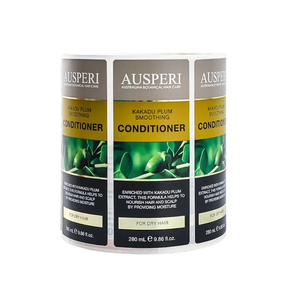
Nutrition facts label requirements for font, format, and printing turn the panel into a typographic spec, and the printer who improvises the type prints a rejection. The panel’s format, its type floor, its rounding, and its placement each follow the current template, and the prepress checklist reads them in order. Food and beverage labels and packaging carry the panel on the pack, so the label plan and the panel art are one document. The typographic spec is the panel’s contract, and the press follows it.
This guide walks the nutrition facts panel from its required formats to the type rules, the serving and rounding presentation, the placement, and the printed-sample checklist. The walk ends with the gates that catch the panel’s classic reprints before the plates. Each section names the line and the check that keeps it exact. The mechanical checks run first, and the human reading closes the loop.
Required Nutrition Facts Panel Formats

The panel formats are drawn by the template, and the artwork copies the drawn block.
The Template Versions
The nutrition facts panel prints in the current template’s formats, and the artwork pulls the approved version, not a remembered one. The template sets the title, the hairlines, the column breaks, and the footnote, and each part has its place in the block. The outdated template is the reprint’s first cause, and the version check runs before the layout check. The version number names the template, and the file name names the version.
The Format Variants by Panel Size
The template offers the full format and the compact variants, and the pack’s available space names the variant. The small pack prints the tabular or the linear format, and the large pack prints the full block with the footnote. The variant is chosen by the label area, and the artwork matches the variant to the surface before the design plays. The variant is the format’s fit, and the fit is measured on the pack.
The Block That Must Stay Whole
The panel prints as one block, and the artwork export keeps the hairlines, the columns, and the footnote together. The block that splits across the fold or loses its hairline in the export is the broken panel, and the preflight catches it. The whole block is the compliance unit, and the check reads it as one. The compliance unit is the whole block, and the check reads it whole.
Type Size, Line Rules, and Panel Legibility
The type floor protects the reading, and the line rules keep the block together.
The Minimum Type Size
The minimum type size rules scale with the panel area, and the smallest panels keep a floor near one sixteenth of an inch. The type height is measured on the printed label, not on the screen, and the required lines never fall under the floor. The smallest pack still owes the reading, and the floor protects it. The floor is measured in print, and the screen lies.
The Font Choice
The nutrition facts panel prints in the template’s typeface, and the artwork copies the approved format rather than choosing a decorative font. The best font for a food label is the legible one the template allows, and the required lines read at arm’s length on the printed pack. The panel type stays quiet, and the brand type stays outside the block. The approved typeface is the panel’s voice, and the artwork never replaces it.
The Line Rules and the Hairlines
The hairlines and the rules inside the panel follow the template’s line weights, and the artwork export keeps them intact. The rule that disappears under the small type, or the hairline that touches the text, breaks the block’s reading. The line check runs on the printed sample, and the sample is the honest proof. The hairlines keep the rows apart, and the missing line blurs the reading.
The Three Font Rule
The three font rule limits a label to three typefaces, and the nutrition facts panel counts as one of them. The label that stacks the decorative fonts crowds the required lines, and the panel loses its quiet ground. The rule keeps the reading hierarchy, and the artwork respects it on every face. The hierarchy reads from the type, and the third font closes the set.
The Legibility Check on the Substrate
The legibility check prints the panel on the real substrate, and the reading happens at arm’s length. The film, the gloss, and the foil each change the fine type, and the check runs on the stock the order uses. The sample that reads on the substrate reads on the shelf.
Serving Size, Nutrient Values, and Rounding Presentation
The serving fixes the numbers, and the rounding rules fix the printed values.
The Serving Block
The serving size and the servings per container open the panel, and every number below them belongs to that serving. The serving comes from the approved product file, and the artwork copies it verbatim. The stale serving above the new numbers is the panel’s most expensive typo. The serving block opens the reading, and the numbers follow its lead.
The Nutrient Rows
The nutrient rows print in the template’s order, and each row carries its amount and its percent daily value. The values come from the tested formula, and the artwork copies the approved numbers exactly. The swapped milligram and microgram, and the dropped percent, are the row’s classic slips. The row check is slow, and the slow check is the cheap check.
The Rounding Presentation
The template’s rounding rules set how each nutrient’s amount prints, and the artwork carries the rounded value from the approved file. The round on the artwork is the drift, and the drift is the reprint. The panel and the product file read from the same numbers, and the proof checks the pair. The approved file carries the rounded values, and the proof checks the pair.
The Product File and the Panel
The panel values come from the product file, and the file is the single source for the serving, the nutrients, and the percents. The artwork copies the file’s numbers, and the proof reads them back against the file. The panel and the file stay one record, and the review keeps them together.
| Panel Element | What It Must Match | Common Print Error |
|---|---|---|
| Serving block | The approved product file | The old serving from a past revision |
| Nutrient rows | The tested formula values | The swapped units on one row |
| Percent daily value | The template’s reference math | The dropped percent on one row |
| Footnote | The template’s reference note | The truncated or missing note |
The Panel Printed to the Template

Panel Placement and Available Label Space

The panel takes its assigned surface, and the design plans around that surface.
The Information Panel Placement
The nutrition facts panel prints on the information panel beside the ingredient list, and the placement is drawn before the design. The bottle’s curve, the carton’s side, and the pouch’s back each carry the panel on their own surface, and the artwork lays the block out per surface. The placement rules follow the pack, and the design bends around the block. The surface names the layout, and the layout keeps the columns straight.
The Space Budget
The label’s space budget reserves the panel’s area before the brand elements claim the rest, and the compact variant opens when the space runs short. The budget runs the panel, the ingredient list, and the required lines first, and the marketing fills what remains. The panel that loses its area to the logo is the panel that reprints. The budget reserves the required lines, and the design fills the rest.
The Odd Shapes and the Folds
The panel avoids the folds, the seams, and the squeeze zones where the type would curl or break, and the artwork maps the block to the flat stretch. The curved bottle wrap keeps the columns straight, and the fold keeps the block whole. The placement check reads the printed sample on the actual pack, not the flat proof. The fold keeps the block whole, and the curve keeps the columns straight.
The Compact Variant Rules
The compact variants keep the required content while the block shrinks, and the variant choice follows the space budget. The compact panel trades the columns for the stacked lines, and the content stays whole. The variant is a template choice, not a design improvisation.
Prepress and Printed-sample Checklist for Nutrition Facts
The prepress gates read the file, and the printed sample reads the truth.
The File Gates
The file gates check the template version, the type floor, the hairlines, and the exported block before the proof, and each gate clears or sends the file back. The FDA food labeling requirements for packaged foods frame the panel’s wider rules, and the nutrition facts vs supplement facts labels guide keeps the panel family straight. The gates are mechanical, and the mechanical pass is the cheap pass. The file pass clears before the proof, and the proof clears before the plates.
The Printed Sample Gates
The printed sample gates read the physical proof at arm’s length, under the store light, on the real substrate, and the sample is scanned, not just looked at. The flexographic printing standards frame the print quality side, and the sample pass is the label’s dress rehearsal. The proof that reads on the sample reads on the shelf. The sample is the label’s dress rehearsal, and the store light is the audience.
The Five Gate Checklist
The closing checklist runs the panel through the five gates in order, and a file that fails one gate goes back before the plates. The food label printing mistakes guide walks the rest of the reprint causes.
- Confirm the template version against the current rules.
- Check the type floor and the hairlines on the file.
- Read the serving and every nutrient row against the product file.
- Verify the panel placement on the actual pack surface.
- Read the printed sample at arm’s length before the signature.
The Sign-off and the Archive
The signed proof closes the run, and the archive keeps the version, the date, and the approver. The old versions stay in the folder, and the press runs only the released file. The archive is the label’s memory, and the memory prevents the reprint.
Perguntas frequentes
What is the minimum font size required for food labeling?
The minimum type size rules scale with the panel area, and the smallest panels keep a floor near one sixteenth of an inch.
What is the font for nutrition facts?
The nutrition facts panel prints in the template’s typeface, and the artwork copies the approved format rather than choosing a decorative font.
What is the best font for food labels?
The best font for a food label is the legible one the template allows, and the required lines read at arm’s length on the printed pack.
What is the 3 font rule?
The three font rule limits a label to three typefaces, and the nutrition facts panel counts as one of them.
Why are nutrition facts important?
The nutrition facts panel matters because the buyer reads the serving, the calories, and the nutrients before the purchase.
Which is not legally required on a Nutrition Facts label?
The panel leaves off the extras the rules do not ask for, such as the marketing slogans, the recipes, or the serving suggestions.
Conclusion
The nutrition facts panel is a fixed block of type, rules, and numbers. The printer’s job is to carry it into print exactly as the template and the product file define it. The prepress gates catch the drift on the file, and the printed sample catches the rest on the substrate.
For food brands that want the panel and the print run as one spec, Meikei handles the format, the type, and the proof with the gate discipline the panel requires.