CMYK vs. Pantone is settled by three questions: what the brand color is, how exact it must be, and how many stations the budget allows.
This guide walks the two systems in order: the CMYK build, the Pantone spot color, the gamut and accuracy, the cost and production, and the choice rules for labels and cartons. Each section names what the system can and cannot do. Find your answers in this article.
Color Building in CMYK Process Printing
CMYK builds colors from four inks, and every color in the process is a mixture, never a single press.
Process printing builds the full image from four inks, cyan, magenta, yellow, and black, laid down as halftone dots. Every color on the package is a dot pattern of those four, and the eye blends the dots into the color.
Every color on the package is a dot pattern of those four, and the eye blends the dots into the color. The system prints the whole design with four stations, whatever the design contains. The station count stays flat.
The Four Inks
The four process inks are standardized, so one CMYK build prints roughly the same on any press that is calibrated. The four stations print photographs, gradients, and brand colors in one pass. The economy is the system’s core, and its limit is the colors the four inks cannot reach.
The limit is where the spot system starts.
Where CMYK Fits Packaging
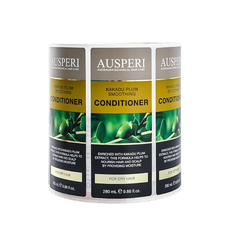
CMYK fits packaging with photography, illustrations, and gradients, the artwork built from many colors. The brand colors inside it are matched to the closest process build. The system is the default for cartons and labels with full-color art, because the four inks carry everything.
Advantages of Pantone Spot Colors in Packaging Print
The spot color arrives premixed, and that is its entire advantage in one sentence.
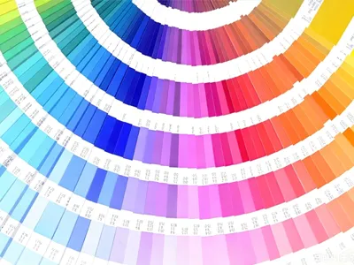
A Pantone spot color is a premixed ink, mixed to a recipe from the Pantone book, and it prints as a solid, single color.
Because the ink is mixed before the press, the printed color is the recipe’s color, not a dot blend. The solid ink also reaches colors the four process inks cannot build.
Brand Color Accuracy
The brand color is the spot color’s home ground. A corporate blue or a signature red prints as the exact recipe on every order, on every press, because the ink itself is the standard.
The brand’s logo color is the classic reason a packaging program adds a spot station. The logo is the one color your brand cannot compromise.
Beyond the Process Gamut
Spot colors reach where process printing cannot: the bright oranges, the deep blues, and the metallic and neon inks that live outside the four-color gamut.
The brand that owns one of those colors needs the spot station. The gamut is the map, and the spot ink prints off the map’s edge. The edge is where the specialty inks live.
Color Gamut, Brand Color Accuracy, and Repeatability
The gamut is the map of colors each system can reach, and brand colors live inside or outside it.
The comparison on accuracy runs three lines: the gamut, the brand color match, and the repeatability across orders.
The process system’s gamut is smaller, its brand match is approximate, and its repeatability depends on press calibration.
The spot system’s gamut is wider at the edges, its match is exact, and its repeatability is the ink recipe itself.
Color standards bodies such as Idealliance publish the reference methods both systems are judged against.
The Brand Color Test
The brand color test prints the logo color in both systems and measures the difference against the reference.
A color inside the process gamut matches closely in CMYK, and a color outside it needs the spot ink. The test result, not the preference, is what chooses the system for the logo.
For the screen-to-print gap behind that test, see our article on print color mismatch. The proof shows the difference on paper.
Repeatability Across Orders
Repeatability is the same color on the tenth reorder as on the first, and the two systems reach it differently. The spot ink repeats because the recipe is fixed, and the process build repeats because the press is calibrated to the standard. Both routes hold the color across orders. Both work, and the spot ink needs less maintenance to hold its number. The recipe holds the color steady.
The color cluster inside the wider mistake map is covered in our article on common food label printing mistakes. The color checks there are the same ones this guide measures.
Cost and Production Implications of Process and Spot Colors

Every extra spot color adds a station and a cost, and the number of stations is the real budget.
The cost comparison runs on stations. Process printing holds at four stations whatever the artwork. Every spot color adds a station, an ink, and a washup between jobs, so one spot color on a four-color job is a five-station job.
The Station Math
The station math is simple: four process inks cover everything, and each added spot color adds one station. A brand color and a metallic add two stations to the four.
The math is the budget, and the budget decides how many of the brand’s colors earn a spot station. One spot is the usual answer.
Volume and the Break-even
The spot ink’s cost spreads over the run, so the per-unit premium shrinks as the volume grows. A long run absorbs the extra station, and a short run feels it. The break-even sits somewhere in the volume ladder. The volume is the third input in the system choice, after the color and the artwork. The three inputs run in that order.
The color systems sit inside the wider printing mistakes and finish map. For the six mistake clusters that include color, see our article on common food label printing mistakes.
The Right Color System for Your Brand Color
Choosing A Color System for Labels and Folding Cartons
The system choice is made by the brand color, the artwork, and the volume, in that order.
The choice rules run in a fixed order. The brand color comes first, because a color outside the gamut forces the spot ink. The artwork comes second, because photography and gradients favor process.
ラベル
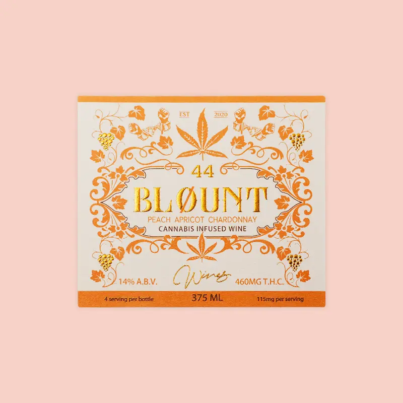
Labels lean process for photographic and illustrated work, with one spot added for the brand color when accuracy demands it. The small label area makes the spot’s solid ink read strongly. The label’s system is usually CMYK plus one spot, the working compromise of the category. The spot carries the logo.
Folding Cartons
Cartons carry more area and more brand presence, so they earn the spot stations more often, and the logo color gets its own ink. The carton is the brand’s flagship, and the color system reflects it.
The carton is the brand’s flagship, and the color system reflects it. The same brand often runs process on the label and spots on the carton.
The finish layer that sits on top of either color system is compared in our article on best label finishes for premium products. The coating changes the color’s look, and the two decisions are made together. The finish and the color system are one spec.
よくある質問
What is a PMS color vs CMYK?
A PMS color is a premixed Pantone spot ink printed as a solid, and CMYK is a four-ink process that builds colors from dots. The spot ink is one exact color, and the process is a blend of four. The names describe two different ways to make a color. The package can use both at once.
How to convert CMYK color to Pantone?
The conversion finds the Pantone swatch closest to the CMYK build, using a physical fan book or a matching tool. The match is an approximation, because the two systems reach different color sets. The printed proof confirms the match is close enough. The screen conversion is only the first estimate.
What does Pantone stand for?
Pantone is the name of the company that built the standardized color matching system, with numbered swatches and ink recipes. The name has become the industry’s word for a spot color. The system’s point is that one number means one color everywhere. The number travels with the artwork.
What is the color mode used for printing?
Print uses the CMYK mode for process work, with spot colors added as named inks where the brand needs them. Screens work in RGB, and the print file converts to CMYK. The print color mode is subtractive, and the screen mode is additive. The conversion is a translation between them.
What is spot color in printing?
A spot color is a premixed ink printed as its own solid, from its own station, instead of being built from the process inks. The spot prints one exact color. It is the tool for brand colors and inks the process cannot mix. The solid ink is the exactness tool.
What is the difference between spot color and process color printing?
Process printing builds every color from four dot patterns, and spot printing lays down premixed solid inks. The process carries the whole artwork in four stations, and each spot adds one station. The two differ in how the color is made. The artwork picks between the two ways.
Is a Pantone color a spot color?
はい, a Pantone color is the industry’s standard form of a spot color, referenced by its number and printed as a premixed ink. Every Pantone color is a spot color, and spot colors also exist outside the Pantone system. The two terms usually travel together. The number is the color’s name.
Can a spot color be CMYK?
A spot color can be simulated in CMYK with a process build, and the simulation is approximate, because the two color sets overlap imperfectly. The simulation is what happens when the spot station is dropped for cost. The brand color check shows how close the simulation lands. The proof decides whether close is close enough.
Why are Pantone colors so expensive?
Each Pantone color adds its own station, its own ink, and a washup between jobs, and those costs repeat on every order. The license fees for the color system add a smaller layer. The premium is the price of the exact brand color. The budget weighs the exactness.
Can you give me an example of spot color?
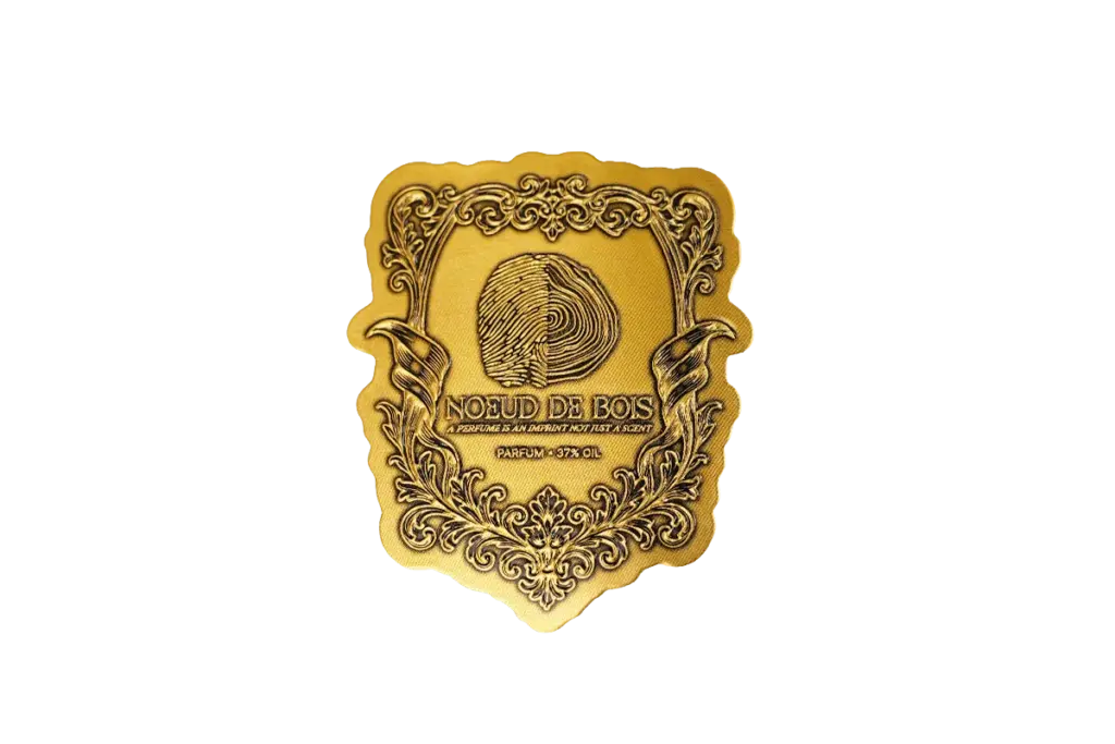
A brand’s signature red printed as one premixed ink is the classic spot color, and a metallic gold or silver is another. The ink arrives mixed to the recipe and prints as a solid. The logo color on a carton is where shoppers meet spot color daily. The solid ink is the brand’s signature.
Conclusion
CMYK versus Pantone is settled by the brand color first, the artwork second, and the volume third. The process system carries photography and gradients in four stations, and the spot ink carries the brand color that must be exact. The station math decides how many spots the budget holds. The packaging programs that read the three inputs before the press get the color they signed for, which is the entire point of the choice.
If your brand is choosing a color system, Meikei tests your brand colors in both systems and prints the proof that shows the difference.